Signed in as:
filler@godaddy.com
The client approached me with a name, an idea, and a dream: Patatia. This concept focuses on the beloved potato and aims to be a grab-and-go destination in the heart of Saudi Arabia — featuring a diverse menu centered around baked potatoes, crisp salads, and hearty sandwiches, all enhanced by signature sauces.
While the name Patatia was already chosen and the concept was laid out, what was missing was everything that would transform it into a brand, distinguishing it from mere menu offerings.
My challenge was clear: how can I take a humble ingredient like the potato and elevate it into a bold, lovable, and instantly recognizable food brand in one of the most competitive F&B markets in the region?
I wasn’t tasked with inventing the name; rather, I needed to create the vibrant world in which the name Patatia would thrive, much like the emerging influencer coffee shop culture that is also shaping the Saudi Arabia food scene.
I positioned Patatia around one simple truth: The potato is the most loved, most versatile, most universally craved comfort food on earth — and it deserved a brand as fun and satisfying as it is. In the vibrant Saudi Arabia food scene, people don't walk into a potato shop for fine dining. They walk in for comfort, craving, and a quick dose of joy. So I built Patatia as a brand that feels exactly like that experience — warm, playful, generous, and unapologetically fun. My strategic pillars were simple: Make the potato the hero — no shame, no gimmicks, just pride in the spud. Keep it grab-and-go — fast, friendly, and frictionless for busy urban lifestyles. Own the joy — every touchpoint should feel like a smile in food form. Stay crave-worthy — bold enough to stop traffic, warm enough to bring people back. Patatia wasn't going to be "just another potato spot." It was going to be the potato destination — a world you step into, not just a counter you order from. Just like the atmosphere of an influencer coffee shop, Patatia embraces joy and comfort, making it a must-visit in the food scene.

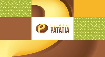
This is where the magic happened. I designed a logo for Patatia that turns the brand's first letter into its hero ingredient; the "P" of Patatia is the shape of a potato itself. Every design decision was intentional: A custom wordmark where the initial letter curves and rounds into the unmistakable silhouette of a baked potato — playful, clever, and instantly memorable. Soft, rounded letterforms that feel warm, friendly, and appetizing — nothing sharp, nothing cold, nothing corporate, just like the inviting atmosphere of an influencer coffee shop. A confident, bold weight that holds up beautifully on signage, packaging, and uniforms from a distance. A mark that works as both a wordmark and a standalone icon — the "P" alone becomes a recognizable brand symbol, perfect for app icons, stamps, and social avatars. It's a logo that tells the entire brand story in a single glance: "We're about potatoes — and we're proud of it," capturing the essence of the Saudi Arabia food scene.
I crafted a visual identity for Patatia, an influencer coffee shop that feels warm, appetizing, playful, and confidently crave-able.
A hearty, earthy color palette — warm browns, golden yellows, fresh greens, and creamy neutrals that mirror the colors of fresh potatoes, vegetables, and signature sauces, perfectly suited for the vibrant Saudi Arabia food scene.
Rounded, friendly typography — welcoming, easy to read, and perfectly paired with the logo's soft personality.
Bold food photography — close-ups of loaded baked potatoes, crisp salads, and sandwich cross-sections shot with natural light and appetizing textures.
Playful illustrations & icons — potato characters, sauce drips, and veggie motifs that bring joy to menus, packaging, and social media.
A voice that's warm and fun — copy that makes people smile, not sweat. "Spud up your day." "Freshly picked. Perfectly potato-ed."
I designed the system so every touchpoint feels like biting into your favorite comfort food — familiar, satisfying, and always worth coming back to.
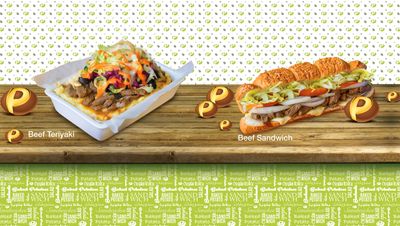
I positioned Patatia at the intersection of three major shifts reshaping the Saudi Arabia food scene: The rise of grab-and-go culture — where busy professionals, students, and families want fast food without compromising on freshness or flavor. The global 'comfort food glow-up' — where humble ingredients (potatoes, grain bowls, sandwiches) are being reimagined as modern, branded experiences. The hunger for Instagrammable, personality-driven F&B brands — where the experience, the packaging, and the vibe are as important as the food itself. Patatia speaks to all three. It gives customers a food experience that's fast, fresh, fun, and full of flavor — with a brand personality that's impossible not to love. From busy workday lunches to after-school hangouts to late-night cravings, Patatia isn't just a potato shop; it's a whole world of spuds, comparable to an influencer coffee shop in its appeal.
Patatia is proof that the best brands, much like an influencer coffee shop, don't need exotic ingredients, fancy concepts, or complicated stories. Sometimes, all you need is one humble ingredient, one bold idea, and a brand that makes people smile the moment they see it.
I didn't design just a food logo.
I designed a personality, a world, a craving.
I took a potato — the most ordinary ingredient in any kitchen — and turned it into a brand that walks, talks, and feels extraordinary.
In a market full of food brands shouting for attention, I built one that simply makes people hungry, happy, and loyal. This approach resonates well within the Saudi Arabia food scene, where authenticity is cherished.
And every customer who bites into a Patatia spud? They've been Berned. 🥔